
Elevating Actegy's Product Experience
CASE STUDIES
Team composition
CEO | E-commerce Director | Head of Brand & Design | Junior Designer | R&D Manager
Context
Following the launch of redesigned product pages on the US market—intended as the foundation for a global rollout—performance declined (Sales and SEO).
Before scaling further, it became critical to understand what was not working and redefine the experience.
🚩 -60% Sales & conversions.
🚩 +60% Bounce rate
🚩 80% Designers time on coding.
🚩 -56% Add to cart after launch.
🚩 Magento 2 block adding content.
Source: Google analytics

Assumptions
🚩 The design was not user-centered, failing to meet user needs.s & conversions.
🚩 Magento 2 still required coding, limiting flexibility.
🚩 No user testing was done, and there wasn't enough content for SEO.
🚩 The redesign was too drastic compared to the previous version.
🚩 No research was done to understand CMS needs across markets.
Problem
The US redesign led to usability, accessibility, ranking and trust issues, making it unsuitable for global rollout.
The design team spends 80% of their time coding content and offer updates, as Magento’s page creation process is not marketing-friendly and requires coding knowledge.
How might we create a user-friendly product page, based on learnings from the failed US design, that allows markets to add content while maintaining a clean, technical, and medical UI?
Goals
User Goals
➡️ Improve trust in the brand
➡️ Better usability on mobile and desktop
➡️ Improve the accessibility
➡️ Better page performance
➡️️ Content & SEO Recovery
Business Goals
➡️ Reduce the bounce rate up to 20%
➡️ Increase the add to card rate by 10%
➡️ Better SEO rank
➡️ Reduce design coding time by 80%
➡️ Retrieve the same rate % as the previous design
Internal Challenges
Challenge #1
Limited access to real users for testing and interviews.
Challenge #2
Multiple stakeholders with different business goals.
Challenge #3
Limited time to choose an agency, CMS, and design.
Challenge #4
Low stakeholder buy-in for UX.
RESEARCH
Competitor analysis
✅ Clean, trustworthy design
✅ Engaging use of images, video, and expandable content
✅ Clear instructions and safety information
✅ Strong customer testimonials
🔴 Missing key CTA on mobile
🔴 Accessibility issues (contrast, autoplay, video)
🔴 Content overload reduces focus
🔴 Text in images limits accessibility
🔴 Low-contrast colours affect readability

Personas
Understand our target audience, their needs, and motivations, so we can design solutions that truly meet their expectations.

Jean Barlow
Retired
Bournemouth, UK
76 yo
Motivations
➡️ Stay active and independent.
➡️ Affordable solution#
➡️ Drug free
“I just want to enjoy my walks with the grandkids without the pain holding me back.”

Muriel Fevre
Clinic admin
Lyon, France
45 yo
Motivations
➡️ Stay active and avoid discomfort
➡️ Find a reliable, easy-to-use product
➡️ Prioritise products that are effective.
“I just want to enjoy my walks with the grandkids without the pain holding me back.”
IDEATE
Wireframes & UI Experiments
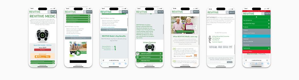
The wireframe for the product page prioritises maintaining the necessary content from the old design while ensuring an improved mobile experience. It incorporates the new medical look and feel while enhancing usability and accessibility.

Experiments
We restructured the product page by adding more content and interactive elements to enhance the user journey. The Junior Designer and I collaborated closely, experimenting with different layouts to balance content needs while maintaining the page’s medical and technical integrity.
We implemented colour coding to differentiate products into 'Good/Better/Best' tiers, visually aligning with the number of features available in each. This approach also mirrors the new packaging design for a cohesive brand experience.


CHALLENGES
Limited User Access Driving Reliance on Corridor Testing
Due to time constraints, limited user access, and low UX maturity, formal usability testing wasn’t feasible, so we gathered usability feedback through internal corridor testing.
"I love how the cards can scroll right and left, it feels a lot smoother and intuitive"
Amalia.
Customer Service
"It looks clean and professional, I feel I can trust the company more than before"
Tom
Amazon Key Account


SOLUTION
New Product Pages
1. Accessible
All text and interaction elements are following WCAG guidelines and UX best practices.
4. New Headless CMS
After gathering market requirements, we have chosen Contensis as our new headless CMS.
3. Reusable components
Reusable components design for all product pages to ensure consistency and reduce development time.
Outcomes
I guided the Junior Designer in applying metrics to her design. This was especially crucial since we didn’t conduct direct user testing, making data-driven insights essential for future improvements. This helped us gathered the right data when we implemented.
📊 +10% Sales Increase
🚀 -53% Page Load Time
🗣️ Better Website review: NPS
🏆 Increase of 3% conversion
📉 Better bounce rate. From 60% to 30%
🧑💻 No more time for development
📈 + 5% add to card
📱 Better SEO ranking
Future improvement in Backlog
✅ Run A/B tests to optimise the product page CTA and improve conversion rates.
✅ Promoted the value of UX design thinking to stakeholders to strengthen buy-in and advance UX maturity.
✅ Conduct user surveys to identify pain points and gather feedback for potential improvements.
✅ Organise and conduct the first usability test with supported by the CRM and e-com Directors.
✅ Enhance key pages in the user journey to create a smoother experience and drive higher sales.
Team Successes
Junior Designer
Thanks to her dedication, extensive research, strong visual work, and data-driven design approach, the Junior Designer was recognised by the Head of UX (App) for her contributions. As a result, she was invited to collaborate with him on improving the Revitive Medic Coach App.
Personal
I had the opportunity to lead a usability and accessibility workshop for the global Actegy team and international marketing team. The session highlighted the importance of designing for all users and demonstrated how digital design follows different principles than print."


