
Fixing a Failing Checkout to Boost Sales
CASE STUDIES
Team composition
CEO | E-commerce Director | Head of brand & design | Junior designer
Context
Actegy’s mobile-first checkout redesign failed, leading to higher abandonment rates and lower conversions.
With 70% of orders from mobile, fixing usability and accessibility was critical.As the UX Lead, I guided the team in improving usability, accessibility, and overall flow to increase conversions and boost sales.
🚩 Abandonment rate went from 66% to 70% in 6 months
🚩 +60% Bounce rate
🚩 -56% in add to cart after launching the new site.
🚩 Conversion rate went from 3% to 2.3%
Source: Google analytics

Problem
The US redesign on the checkout journey led to usability, accessibility, ranking and trust issues, bring down the conversion and making it unsuitable for global rollout.
🚩 The design was not user-centered, failing to meet user needs.s & conversions.
🚩 The design lacks in accessibility elements.
🚩 The redesign was too drastic compared to the previous version.
🚩 No research was done to understand the user journey on the checkout.
How might we optimise the checkout flow to improve usability and accessibility, reducing friction and increasing sales conversion while ensuring it scales effectively across multiple global markets?
Goals
User Goals
➡️ Improve the overall journey
➡️ Better usability and accessibility on mobile
➡️ Simplify the checkout step
Business Goals
➡️ Go back to an abandonment rate of 66%
➡️ Return to a 3% of conversion rate
➡️ Increase sales volume 6 months after release
RESEARCH
Competitor analysis
I conduct competitor analysis upfront to identify industry standards and opportunities, ensuring my wireframes are both competitive and strategically differentiated.
✅ Guest checkout available.
✅ Multiple Payment available.
✅ Clear delivery method with fees.
✅ Accepted payment methods clearly shown.
✅ Possibility to register the machine.
✅ Click and collect option.
🔴 Account creation required every time.
🔴 Time and delivery picking difficult on mobile.
🔴 No clear separations between the 3 steps.
🔴 Contact icon blocks the usability.
🔴 No order summary available through the checkout flow.


TESTING
Moderate User Testing
Key elements for testing usability improvements
✅ Simplified checkout flow for a smoother experience.
✅ No mandatory account creation to reduce friction.
✅ Multiple payment options for flexibility.
✅ Seamless VAT exemption process for eligible users.
🕵
5 internal users
⚙️
Moderate testing
⏱️
40 minutes
📱
Mobile testing
4/5
users
Support button feels intrusive
The button is too prominent, distracting users from primary tasks.
5/5
users
VAT exemption is hard to find
Poor visibility creates confusion and blocks eligible users.
2/5
users
Back navigation lacks visibility
Low visibility makes it difficult to locate, increasing navigation friction.
3/5
users
Payment options lack clarity
Available methods are not easily noticeable or clearly communicated.
5/5
users
Delivery step is expected earlier
Users expect to select delivery type before entering address details.
5/5
users
Checkout experience is smooth
The flow is intuitive and efficient once users reach this stage.
SOLUTION
Final user flow
Following the feedback, I reviewed and proposed an improved flow.
.png)
3 Improvements for 3 Principals
Moving forward with a priority session, we agreed on 3 MVP changes focussing on 3 principles:
- ease of implementation
- no additional capacity
- immediate business impact.

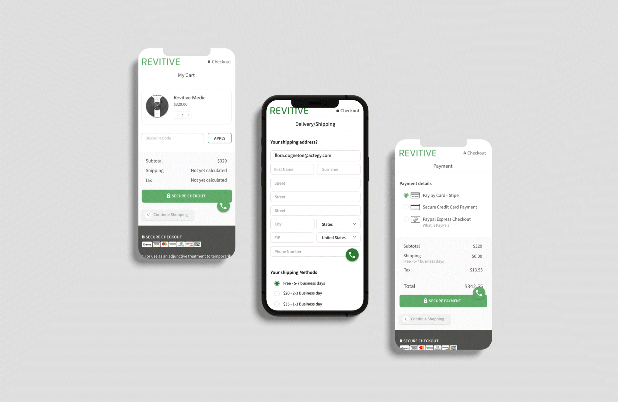
1. Simplify and surface VAT exemption
VAT exemption was made clearly visible while keeping the experience simple.
A dedicated page was introduced to provide the necessary information without overloading the checkout flow
2. Reorder delivery selection
Delivery type was moved before the address form to align with user expectations.
This reduces friction and supports a more logical, streamlined checkout experience.

3. Clarify payment options
Payment options were simplified and made more visible to reduce confusion and potential drop-offs.
Three clear options were introduced to support faster decision-making.
Impact of the new design
We applied metrics to our design, which my team reviewed every 3 weeks.
This was especially crucial since we didn’t conduct direct user testing and to make sure we could make changes quickly without impacting the sales.
📊 Card abandonment is back to 66%, as it was before the redesign.
💬 Positive user feedback on clarity and ease of use (from NPS)
📈 Checkout conversion has improved slightly from 2.3% to 2.7%
♿ Improved accessibility following WCAG 2 practices
📈 15% increase in sales (could also be due to Covid)
Team Successes
Junior Designer
First time writing a user test plan and conducting the test. This was a great learning curve and she became more confident at the end of the testing sessions.
They also became the UI designer for the new Revitive Medic Coach app.
Personal
I had the chance to show the importance of user centred design with the great user feedback we had. This was a step forward in communication the importance of UX within the company.


Next Steps
♿ Keep on improving the accessibility & usability.
🚀 Expend product ecosystem: order tracking, account management.
💡 Improve the components and provide improvements.
🕵️ Run A/B tests and iterative improvements to further reduce friction and increase conversion.
