
Context
BMI, a roofing and waterproofing company, aims to develop a new tool to enhance the efficiency and safety of roofers, inspired by the success of a similar tool used by their sister company, GAF, in the US, BMI.
Roof measurements are often dangerous and prone to errors, so this tool was designed to address these challenges and make the job easier for roofers.
It would be built on InTouch, BMI's private platform where roofers can record and follow their projects and guarantees.
Challenges
🚩 Limited customer access
🚩 Pressure to fast-track UX
🚩 Difficulties to believe in the tool from internal team
🚩 InTouch, that will host PlanMaster, does not follow BMI Style guide.
Business Needs
Charge for reports?
We’re exploring the option to make reports paid based on user type. This could support different user needs while opening a path for monetisation.
Third party report delivery
Reports will be sent by a third-party provider via email, we need to keep the flow simple and avoid adding extra steps for users.
MVP Solution
MVP version to launch by March 15, in time for the German roofing trade fair. Our System Partners will use this first version to order their reports for free.
Problem
Roof measurements are often dangerous and inaccurate.
BMI needed a digital tool that would make this process safer and more reliable for roofers which would also be available in a report easy to download and print. It had to be accessible behind a login/registration area — designed for professionals across Europe, regardless of their digital skills.
How might we deliver a simple, easy to use tool to support roofers in measuring roofs safely and accurately, without adding complexity to their workflow?
User Goals
➡️ Simplicity of use
➡️ Usable and accessible on mobile and tablet
➡️ Report fast and accurate
Business Goals
➡️ Double the InTouch usage by the end of 2024
➡️ Reach 2,000 report orders by year-end
➡️ Launch in 3 countries by the end of 2024
➡️ Improve InTouch overall UX
RESEARCH
Competitor analysis
Given the novelty of the product, I led a competitor analysis to benchmark user journeys, define essential features, and identify opportunities to inform the product strategy.
✅ Simple user flow with clear & visible steps.
✅ Showing price from the beginning.
✅ Potential multiple reports available.
✅ Consistency across all BMI Products which will save development time.
✅ Large map for better usability on desktop and tablet.


User Flows
We were asked to create a one-page, visual-first version to explore Wienerberger’s idea, as preferred by our stakeholder.
➡ I pushed Olha to work on the user flow for the different phases that were mentioned during meetings:
Phase 1: no payment required
Phase 2: payment required and Paypal integration


IDEATE
UI Experiments
During ideation, we explored multiple UI directions to avoid relying on a single, stakeholder-driven solution.
This allowed us to test different approaches before converging on the most effective experience.
✅ Most of the components must be already implemented by the developer's team.
✅ 90% of InTouch users are on Desktop, but all screen sizes should be worked on.
✅ Aligned with the development team and third-party provider on technical feasibility.


Experiments #2
Olha proposed a user journey with:
-
Map selection
-
Address confirmation
-
Details information
-
Order confirmation
How does the user return to the landing page?
What happens if the pin isn’t placed on a building?


Experiments #3
Olha designed a section flow where components appear progressively based on user actions, following GAF’s journey.
How would this work for blind or neurodivergent users?
Is this option easier to implement or easier to use?
Least favourite option by the development team.
Recommendations
➡ Version 2 is the strongest solution from the UX Team.
➡ Review the technical limitations with our third-party agency.
➡ We need a full width map for better accessibility and usability.
➡ Report page not part of the MVP solution but should be kept for future improvement.
➡ Version 2 offers a better flexibility for future improvements.
New Recommendations
While Olha was working on the visuals, several business and strategy discussions took place and they decided to provide free reports to some Roofer members, while offering a paid version to new users—potentially with the first report free to encourage adoption and generate revenue.
Updated Requirements
✅ Integrate a payment option using PayPal.
✅ Add an address validation step before the user can continue.
🔔 Reports generated manually: 48h report availability
Given these changes in business direction, I proposed to the PO that we reassign Olha’s User Testing ticket to a new UX/UI ticket focussing on payment options and report types.
Also, the exact pricing is still under discussion, and an upcoming customer research—based on updated UX designs—will help inform this decision.

➡ After Olha created two versions of the flow, I suggested we proceed with testing both options with our colleagues, as originally planned, before the new requirements were introduced.

TESTING
Moderate User Testing
Olha prepared for moderated UX testing by creating a detailed test plan and a script, designed to support data transcription and insights capture.
🕵
5 Internal users
🖥️
Desktop view
⏱️
40 minutes
At the same time, the German marketing team decided to run a user test to assess user readiness and determine suitable price ranges for single and multiple reports.
2/5
users
Report type icons lack clarity
Icons do not clearly communicate the different report types, creating confusion.
4/5
users
Map and pin interactions are limited but valuable
Users expect more interaction within the map but appreciate the ability to move the pin on the map.
3/5
users
Report type selection expected earlier
Users expect to choose the report type before entering the address.
4/5
users
Order confirmation is unclear
Users are unsure whether the order will be sent via email.
3/5
users
Address information feels missing
The page lacks clear address visibility, creating uncertainty.
98%
users
High adoption interest
German users see the tool as intuitive and efficient, with clear potential to save time.
SOLUTION
Simplicity & ease of use
1. Clear Building Type Selection
Select the building type using clear icons before entering the address to ensure a smooth flow.


2. Enhanced Information & Readability
Key information has been added to the success page, and users must interact with the page to complete the process, ensuring they don’t miss important details.
WE DID NOT UPDATE
3. Simple Map Interaction
To meet time constraints, map interaction wasn’t expanded, but the address entered in the previous step is now displayed for confirmation.
Full map functionality and accessibility improvements are planned for future updates.

Project Challenges
As a lead, I encountered multiple challenges while working and supporting my designer on this product creation.
PO & Stakeholder bias impacted design priorities
Action:
I used data-driven insights to defend high-priority UX tasks in backlog.
Stakeholders fast-tracked development, bypassing UX.
Action:
Joined all stand-ups and included designers in PO development presentations to catch issues before component launches.
Designer left mid-project.
Action:
I secured interim support and redistributed tasks within the team, to ensure continuity.
QA gaps led to UI issues being missed.
Action:
Implemented interim design QA reviews to catch issues early, and involve QA within the design solution presentation.
Key Metrics & Outcome
Metrics are critical for understanding user behavior and addressing discovery challenges. We’ve identified five key metrics to track over the next three months, with support from the Data Analyst team.
🥇 Completion rate
🏅 Bounce rate
🥈 Frequency of return visits
🎖 NPS - Net promoter Score
🥉 Error rates
Outcomes
6 Months post launch
🌍 Rolled out in 5 countries within 1 year.
💰 New revenue stream for BMI.
📊 1400 reports order in the first 6 month
🚀 Massive user growth in Germany → 113 to 1,317 InTouch visitors.
📈 71% of returning customers within 6 months
2135 report in the 6 months after.
Launch announcement on LinkedIn
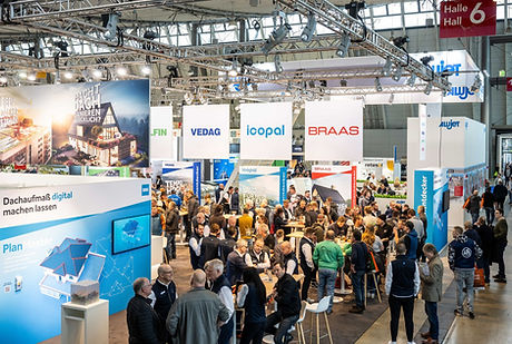
BMI stand at the DACH+HOLZ International roofing Event - PlanMaster launch
Team Successes
Olha's growth
Olha planned, organised, and conducted user testing, delivering clear insights and recommendations that earned her mid-weight responsibilities.
UX Team recognition
This project strengthened the visibility of the UX team across markets and reinforced the value of research-let design.
Personal growth
Stepped into a Strategist & UX Lead role, guiding design decisions while managing stakeholders and advocating for user-centered outcomes.
.png)
Next steps & improvements
While the developers were implementing the tool, the UX team kept on working on improvement, following business requirements and based data from Mouseflow and the metrics in place.
Main improvements
✅ Provide a new payment method: Invoice
✅ Create a drawing area on the map
✅ Provide a promotion code space.
Going further
🎯 Improving the overall communication on the type of reports.
🏆 Starting some A/B tests on key requirements and improvements
